


Fresh off another year of strong momentum across global design fairs, including Coverings 2026, and new collection launches, Ceramics of Italy is unveiling its Spring-Summer 2026 Trend Report.
Throughout the year, Italian ceramic and porcelain tile design has continued to evolve with a focused yet expressive exploration of color, materiality, and innovation. This season reveals a shift toward richer sensory storytelling, from nature-inspired, edible-toned palettes and the resurgence of metallic finishes to pared-back, desaturated hues and organic, advanced wood-look styles.
At the same time, highly expressive, art-driven surface design evolves, with Italian tile continuing to take shape beyond the surface and play more functional roles across interior and exterior designs, driven by new performance capabilities and technical advances.
From these intersecting influences emerge five key trends—Warm, Edible Colors; Gilded Earth; Organic Minimalism; Tile as Art; and Form & Function—that spotlight the creativity, ingenuity, and design leadership from Italian tile manufacturers that are driving the industry forward this season.
Warm, Edible Colors
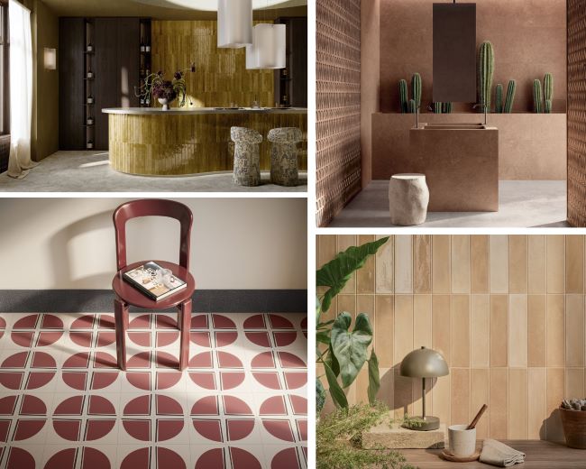
The 2026 tile palette draws direct inspiration from nature’s pantry, embracing a rich spectrum of warm, edible hues—from espresso, chocolate, and cinnamon to turmeric, pomegranate, and creamy ochre—that evoke comfort and nourishment in interior and exterior spaces.
Marca Corona’s Miniature Aroma brings a honeyed caramel warmth, Provenza’s Fornace Provenza collection reinforces the comfort story with cotto-inspired cinnamon and toffee tones, and Ceramica Vogue’s new Flautini format offers glazed, small-scale tile strips in chocolate, tobacco, and deep red wine tones. Flaviker’s Midi conveys a warm, spiced depth that feels grounding and earthy, along with Serenissima Ceramica’s namesake collection, La Serenissima.
Further, Ceramica del Conca’s Ghiaccioli expands the palette into the garden, translating green into delicious iterations of artichoke and sage, while Pastorelli’s Color Up leans into saffron’s energizing warmth through tone-on-tone abstract forms that truly stimulate the senses. Imola Ceramica’s Retina brings a sun-warmed vibrancy through its orange tones.
Rounding out the palette on the deeper end of the spectrum, Cerasarda’s Porto Rotundo explores the lush richness of plum and pomegranate, while CIR Ceramiche’s Marmette collection takes its cues from the world of gelato, offering nine indulgent shades that make the edible color story irresistibly tangible.
Gilded Earth
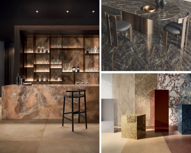
Metallic details have resurfaced as a quintessential design element, with gold emerging as a “new neutral”—evolving from a statement color into a versatile foundation that pairs seamlessly with a wide range of palettes. This trend is characterized by the subtle interplay of gold accents and light.
Versace Ceramics’ Harmony pairs opulent stone and marble looks with gold mirrored décors that accentuate colors and veining, while Tagina’s Luci D’Oro and Energieker’s Luminescence utilize deposited sparkles in the stone and marble veins to create a shimmering effect. Keradom’s Incanto introduces a delicate rain of multicolored gold and warm-toned granules to small formats, adding depth and subtle richness to its surfaces.
Emilceramica’s Tele di Marmo Crystal and Level’s Stormy Onyx uses the striking contrast of light, dark, and gold tones to equally stunning effect, while Ceramica Del Conca’s Stone Edition takes a more grounded approach, pairing gold with warm eucalyptus and chocolate brown for a calming, organic feel.
Faetano’s Dimore, Gardenia & Ariana’s Orosei, and Monocibec’s Thymos take a more artistic direction, weaving metallic and gold tones into intriguing plays of pattern. Ceramiche Refin’s Metamorphosis, developed in collaboration with artist Oliver Laric, brings a sculptural dimension to the metallic trend, combining a lustrous metallic glaze with a lenticular-inspired 3D surface that shifts in visual perception.
Ceramica Fondovalle’s My Top Starlit rounds out the trend by playing with luminosity and surface through backlit technology, accentuating architectural features and enhancing spatial depth.
Organic Minimalism
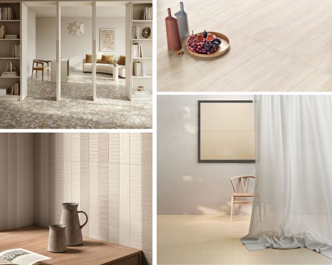
Organic minimalism continues to evolve into a cooler, more restrained aesthetic, creating spaces that feel calm, quiet, and structured, defined by desaturated tones and the integrity of durable materials. In line with the influence of Pantone’s 2026 Color of the Year, Cloud Dancer, color remains muted while surfaces carry the visual interest.
Monochromatic, neutral palettes, as seen in Leonardo Ceramica’s Code, take centerstage, while other collections like Ergon’s GemmaStone, Edimax Astor’s Whisper, Panaria Ceramica’s Perpetual, and Lea Ceramiche’s Pulse, reimagine classic stones like travertine, shellstone, and limestone through soft, matte finishes. Similarly, Caesar Ceramiche’s Histoire collection tells the story of a noble, ancient stone, striking a perfect balance between natural beauty and contemporary comfort, while Milano by Verde 1999 reinterprets terrazzo floors with fragments of Carrara marble, as typically seen in early 20th Century buildings in Milan.
New collections also feature ultra-realistic wood-look surfaces, like La Faenza Ceramica’s Suite Wood and Ceramica Sant’Agostino’s IKI Wood, which showcases an interpretation of reclaimed wood with a resin-style effect. Other new offerings draw on elements like clay, sand, and straw to create a tactile warmth, with subtle textures—raked, ribbed, bush-hammered, and wood-grain—adding depth without relying on contrast. For example, Mirage’s new Shiki collection, designed by Studio Hasuike, draws on the tactile qualities of traditional Japanese tatami mats to create a rhythmic, dimensional surface.
The overarching focus of this trend is on textural monochromatics: layered, sensory surfaces that feel calm, grounded, and welcoming. The result is a more human, wellness-driven approach to design, where function and emotional warmth are seamlessly integrated.
Tile as Art
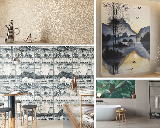
Building on last season’s momentum, tile is continuing to evolve as Italian manufacturers push material into full expression. No longer just a background surface, tile is being treated like high-end wallpaper or a piece of fine art, transforming walls and floors into immersive visual experiences.
This season, the focus shifts toward storytelling. Rather than simple repeating patterns, designers are creating scenes that unfold across a space, drawing the eye in through mural-like compositions, large-scale graphics, and 3D optical effects, as seen in dimensional surfaces like Emilceramica’s Pietra Essenza collection. Ceramics are becoming canvases for both realistic and abstract forms, with collections showcasing hand-painted qualities and more large-scale graphics, as seen in Appiani’s Pastelli collection.
Nature also plays a strong role in this narrative with organic motifs, stone interpretations, and fluid patterns that echo natural landscapes. Cercom Ceramiche’s Silent Stone collection, as seen in its Silent Leaf decorative offering, is inspired by the quiet strength of nature, while other floral-decor looks, such as Ceramica Naxo’s Mind collection and Ceramica Fioranese’s Scaglie di Storie series, bring a soft yet expressive layer to surfaces.
Additional highlights include mural-scale panels and graphic patterns from brands such as Rondine and ABK x Moooi’s Nesting Room, while Aquatic Creatures by Ceramica Bardelli takes a poetic journey into the underwater world, further blurring the line between art and material.
Form & Function
This trend considers how physical shape and purpose come together. It’s not just about how a space looks, it’s about how it works. Thanks to its inherent qualities, Italian tile is redefining this role, moving far beyond backsplash and into a high-performance architectural skin.
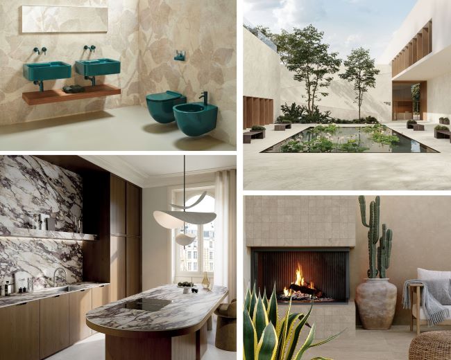
In the bathroom, tile has always been a natural choice for its water resistance, antibacterial and low-maintenance properties. Now, designers are taking it further with tile drenching; wrapping floors, walls, and even ceilings in a single tile or tonal pattern. The result is a spa-like environment that is both practical and immersive, featuring prefabricated washbasins and vanities from premier Italian brands such as La Fabbrica’s Moon Cream and Atlas Concorde’s Nyra Habitat.
In the kitchen, porcelain’s non-porous, heat- and scratch-resistant qualities are driving a surge in demand for large-format slabs as countertops. As opposed to other surface materials, porcelain resists liquids, chemicals, and acids, preventing stains from setting.
Pushing innovation forward, these slabs are now being paired with invisible induction cooktops, as seen in new offerings from ABKSTONE, Atlas Plan, and in Ceramiche Coem’s Immensa collection, with induction coils embedded beneath the surface, allowing for cooking directly on the countertop.
In living spaces, heat-resistant options, such as Casalgrande Padana’s Elements collection, are being applied across fireplace surrounds, while large-format options are also being fabricated into dining, coffee, and conference tables, including MATERIA’s Daino Reale and Shape by Ceramica Fondovalle. Unlike natural marble, porcelain resists etching and staining from spilled drinks, making it virtually indestructible.
Another benefit is that porcelain can move seamlessly outdoors, resisting moisture, temperature changes, and UV exposure without fading. While wood or vinyl may typically sun-bleach, porcelain’s resistance makes it ideal for pavers and high-traffic areas like pool decks and patios, as seen in new collections such as Tufo by Cerdomus, Solaris by Cotto d’Este, Trevi by Ceramiche Keope, and Menhir by Ceramiche Supergres. Additionally, architects are also specifying porcelain for exterior façades, where it acts as a protective layer against UV rays and moisture while extending the interior aesthetic outward.
About Ceramics of Italy
Ceramics of Italy (Confindustria Ceramica) represents Italian manufacturers of ceramic tiles, bricks, refractory materials, sanitaryware, tableware, and ceramics for industrial use. For over 60 years, the association has focused its activities on the needs of its member companies in all national and international contexts. The association’s goal is to connect companies, inform them, and support them.


