Daltile’s “Colorology” webinar highlights emerging design trends
Color is more than a design element, it’s an experience. That message rang out loud and clear during the NTCA Webinar “Colorology,” presented by Daltile. Featuring Hilary Frank, VP of Commercial Sales & Business Development, and Elizabeth Melancon, National A&D Sales Manager for Daltile, the webinar offered an inspiring, data-backed exploration of color’s role in transforming space and mood.
A trend-focused dive into color psychology
Elizabeth Melancon kicked things off with a deep dive into emerging color and product trends as we look ahead. Drawing from Gensler research and global workforce studies, Melancon highlighted how color and materials are being used to reimagine workplace and wellness design. Designers are looking to craft environments that inspire, comfort, and restore as a response to burnout, hybrid work shifts, and the craving for spaces that feel personal and emotionally supportive.
Melancon outlined five core trend categories:
- Regen-Era or Time to Recharge focuses on personal wellbeing and rejecting the hustle culture. It’s depicted by soft and soothing atmospheres with muted colors and materials, including travertine and limestone.
- Organic Tactility promotes a mood of physical safety and brings a peaceful and restorative vibe. This trend features gentle and organic shapes lacking harsh edges, fluted textures, and natural finishes. Materials like stones and clays with carved textures and terracotta that are fresh and timeless bring it to life.
- Heritage Remix combines a blend of nostalgia and modernity, reflecting storytelling through design. This trend mixes the past with the present and is about rewriting our own traditions. It’s a celebration of the home with classic materials like wood, natural stone, and traditional patterns.
- The Indulge trend encourages treating yourself by using products that bring joy and satisfaction. It celebrates healthy indulgence and glamour through sensual color and texture. Materials with striking visuals and heavy veining reflect the maximalist style of this trend, which balances wellbeing with a touch of luxury in everyday life.
- Brutalist Chic embraces a utilitarian charm where the raw, untamed spirit of architecture meets the refined elegance of modern design, creating spaces that are not just lived in but experienced. In this trend, unadorned and uncluttered space can inspire inner calm, honesty, and promote a sense of clarity. It’s a modern interpretation of brutalism with materials like cement and board-formed concrete.
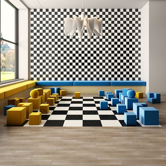
- The Playful Vibes trend celebrates joy and carefreeness, transforming spaces into optimistic, creativity-stimulating havens, and offers an escape from modern stress. These emotionally rewarding environments boost performance through vibrant palettes of bold colors, interesting shapes, and glossy finishes.
From tactile materials to moody hues, Melancon painted a picture of design that connects emotionally and psychologically with users.
Introducing Colorology: A Daltile innovation
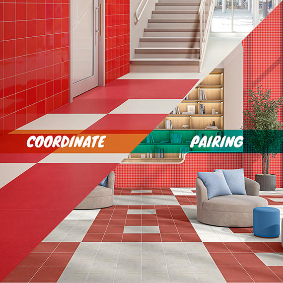
Hilary Frank followed with an in-depth look at Daltile’s new “Colorology” initiative, an innovative program that helps designers use color with intention. Instead of seeing tile as an isolated finish, Colorology maps how hues across product lines coordinate and pair, making it easier than ever to create cohesive and expressive spaces.
Frank demonstrated how color families (white, taupe, blue, marigold, and more) appear across collections, and how Colorology simplifies matching tones that are technically in different series. She emphasized the strength of Daltile’s color offering, not just in range but in usability. “We’ve created a way to show the broad range of color that’s available. This helps weave those key design trends into an interior space in a way that many other building products cannot,” said Frank.
A versatile tool for designers and installers alike
The webinar also spotlighted Daltile’s accessible sampling system, design consultation services, and plans to further expand Colorology tools online. Whether you’re a designer specifying for a major project or an installer helping a client choose finishes, this tool is set to become a game-changer.
To explore these ideas further or revisit the discussion, check out the full webinar at https://tinyurl.com/Daltile-Colorology.