


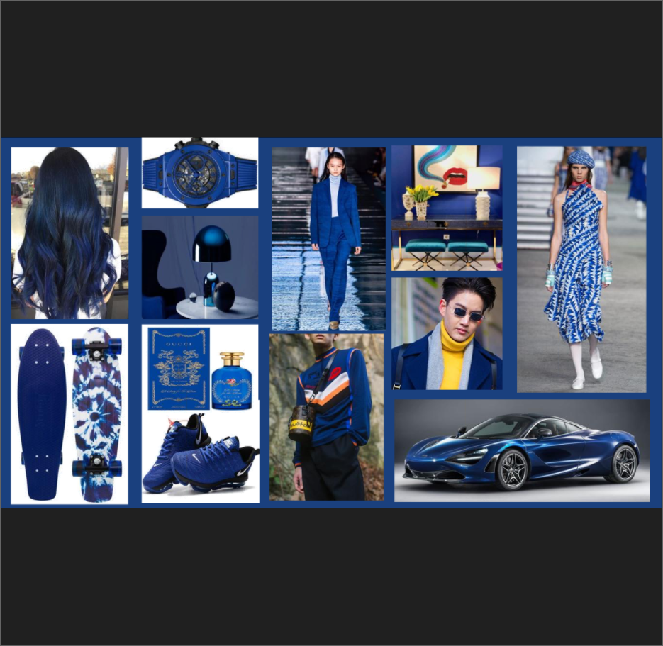
The Pantone Institute has chosen its Color of the Year for 2020: a timeless and enduring blue hue, PANTONE 19-4052 Classic Blue. This hue is elegant in its simplicity and suggestive of the sky at dusk.
The reassuring qualities of the thought-provoking PANTONE 19-4052 Classic Blue highlight the desire for a dependable and stable foundation on which to build as we cross the threshold into a new era.
Imprinted in our psyches as a restful color, PANTONE 19-4052 Classic Blue brings a sense of peace and tranquility to the human spirit, offering refuge. Aiding concentration and bringing laser like clarity, PANTONE 19-4052 Classic Blue re-centers our thoughts. A reflective blue tone, Classic Blue fosters resilience. A red undertone imbues this tone with a feeling of energy and vibrancy. This universal color is relatable around the world and in different cultures.
“We are living in a time that requires trust and faith,” said Leatrice Eiseman, Executive Director of the Pantone Color Institute. “It is this kind of constancy and confidence that is expressed by PANTONE 19-4052 Classic Blue, a solid and dependable blue hue we can always rely on. Imbued with a deep resonance, Classic Blue provides an anchoring foundation. A boundless blue evocative of the vast and infinite evening sky, Classic Blue encourages us to look beyond the obvious to expand our thinking; challenging us to think more deeply, increase our perspective and open the flow of communication.”
As technology continues to race ahead of the human ability to process it all, it is easy to understand why we gravitate to colors that are honest and offer the promise of protection. Non-aggressive and easily relatable, the trusted PANTONE 19-4052 Classic Blue lends itself to relaxed interaction. Associated with the return of another day, this universal favorite is comfortably embraced.
For over 20 years, Pantone’s Color of the Year has influenced product development and purchasing decisions in multiple industries, including fashion, home furnishings, and industrial design, as well as product packaging and graphic design. The Pantone Color of the Year selection process requires thoughtful consideration and trend analysis that culls new color influences from around the world, gleaning inspiration from the entertainment industry and films in production, traveling art collections and new artists, fashion, all areas of design, popular travel destinations, as well as new lifestyles, playstyles, and socio-economic conditions. Influences may also stem from new technologies, materials, textures, and effects that impact color, relevant social media platforms and even upcoming sporting events that capture worldwide attention.


