


A trend trio sets the stage for fashionable interiors
From the brilliant, creative minds of Dal-Tile product designers comes a trio of fashion trends that will affect interiors for the next year. Shelly Halbert, Director of Product Design for Marazzi and American Olean – together with Laura Grilli, Senior Product Designer for Daltile and Ragno – have identified a range of home décor trends that you’ll see reflected in tile and stone products in this issue, at the Coverings expo and in showrooms across the country.
The three trends are: Wabi-Sabi, the principle of being “perfectly imperfect;” Revitalizing the Past, in which the past inspires today’s new designs; and Biophilia Design, which is all about connecting with nature. We’ll explore these trends and view products that exemplify each one.
Wabi-Sabi

Wabi-Sabi design is the Japanese-inspired interior trend that celebrates imperfection. Halbert and Grilli predict that it will become one of the favorite styles in home décor, evoking optimism that accepts our imperfections and making the most of them.
The principles of this philosophy are simplicity, irregularity, beauty in understatement, naturalness without artificiality, subtle elegance, freedom and calmness, impermanence and incompleteness. It celebrates finding beauty in imperfection. Wabi-Sabi shows up in popular culture when movie stars reveal themselves in authentic ways without filters and makeup. We all want to be accepted for what we really are because being perfect is too stressful.
Translated to interior design, Wabi-Sabi manifests in asymmetrical layouts, surfaces with texture and brush strokes, lime-washed finishes, handmade products, as well as raw and natural materials.
Wabi-Sabi colors include Blush, which creates soft and cozy rooms that make interiors feel warmer and welcoming. The vibrancy of spring is evident in mid-tone greens with a hint of yellow that evoke a sense of a fresh start.
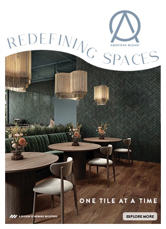
Waterwood™ by American Olean (seen on page 12) reflects the Wabi-Sabi trend. Inspired by European Bricola wood that graces the waterways of Venice, Waterwood is not your everyday oak look. Natural imperfections are formed after years of water exposure and these details are what bring the character and charm to Waterwood. Graceful porcelain planks in 8” x 40” or a 1-1/2” hexagon mosaic are perfect complements to uncommon designs.
Revitalizing the Past

In this trend, everything old is new again. Revitalizing the past is about romanticizing bygone times and bringing them back with fresh new design interpretations. We are seeing it not only in design but in TV shows like Downton Abbey, Outlander, Mad Men, The Goldbergs, as well as in establishments like speakeasy bars, cocktails and fashion.
This trend draws on influences from the Victorian, Art Deco, Mid Century Modern, and Memphis eras.
- Victorian – The romantic Victorian Era was characterized by drama, wealth and luxury. Victorian design is rich and bold with deep, saturated, moody colors and textures. Homes were decorated with lavish wallpaper patterns, like paisley, stripes or florals, and lush fabrics such as velvet. Wood in parquet and chevron patterns, encaustics and marbles graced floors. Victorians loved color and used it to create drama from room to room. Dramatic Victorian colors are saturated tones of black, purple, red, yellow, gray, emerald green and navy blue. On the softer side, Victorian hues include mauve, powder pink, violet, sage, French blue and teal. Following are influences at work within the Revitalizing the Past trend.
- Art Deco – This era was a pastiche of many different styles, sometimes contradictory, united by the desire to be modern. This style was associated with luxury and incorporated mixed metals such as bronze, brushed steel and nickel, polished or inlaid hardwood with unusual graining or patterning, dynamic marbles, circular and geometric shapes such as triangles, hex and chevrons. Art Deco colors are daring and deeply saturated – lavish cream, taupe, blackest black, stark white, orange, yellow, green, blue and pink.
- Mid-Century Modern – From the ornate Art Deco influence, we swing to the simplicity of Mid-Century Modern, with a focus on clean lines and function. Wood is the main material in both flooring and furniture, with organic design that focuses on seamless indoor/outdoor interplay. This trend breathes through a neutral palette of brown, gray and white with accents of color, such as Dijon mustard yellow, burnt orange, teal, navy blue, olive green and deep red. The renewed Mid-Century modern also features pastel colors including Millennial pink, peach, mint green, orange sorbet and pale yellow.
- Memphis – Memphis was a reaction against the status quo of minimalism in the ’70s. The Memphis Group wanted to turn the design world upside down with bold, funky outrageous design. Memphis means bright multi-colored furniture in asymmetrical shapes, with bold Pop Art colors and pastels. Terrazzo and laminate were used in flooring and furniture.

Revitalizing the Past features strong and deep colors you’ll see relating to these trends. The center bar – reading from left to right on page 14 – illustrates these tones:
- Marmalade walks the tightrope between yellow and red, adding a fresh pop of color to any modern design.
- Spiced Nectar’s reddish orange hue evokes passion and gives energy to any design.
- Royal Rose – Bright and powerful, this pink is a way to add playfulness to your design.
- Vintage Violet – A passionate violet that is gentle, caring and sweet.
- Crushed Lilac – Powdery, warm and moody, this hue fits comfortably in both past and present.
- Starry Night – Romantic and classic, this deep blue is making a strong comeback in the design world.
- Windsor Green – With a gray undertone, it’s a transitional hue between gray and green.
Conversely, Revitalizing the Past features also contain airy and pastel hues. The center bar from page 16 – reading from left to right – exemplifies these tones:
- Pale Reflection-A mature evolution from Millennial pink, this is the perfect tone to carry us over the next few years.
- Misty Blue-Soft and sweet, this color reflects our childhood, bringing us back down to earth.
- Wisteria-A timeless progression from soft pink.
- Veranda – This muted sage green is a fresh interpretation of green for 2019.
- Iris speaks romance! It’s sophisticated and raw.
- Sea Side-Vibrant and playful, this blue-green can be a sweet or a bold accent.
- Living Coral is Pantone’s Color of the Year.
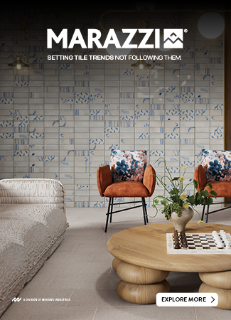
 Epitomizing the Revitalizing the Past trend, Historia™ by Marazzi is a classic reinterpretation of aged stones that will forever be part of our past and future, a truly timeless design. The collection features four unique stone looks that transcend both traditional and modern designs. The deep, rich visuals range from timeless marbles to a classic limestone. Layered into the designs are the natural imperfections and time-worn marks that tell the history of every piece.
Biophilia

We are architects, creators, engineers and builders, but we operate in relationship to the natural environment. Biophilia design is all about connecting with nature. With the modern world immersed in technology, people want an organic environment in which to live and work. Studies have shown that visual connections with nature positively impact attitude and overall happiness.
Today, architects and designers are designing spaces that connect with nature and that are environmentally friendly. This includes sustainable architecture with large windows that allow a view of the outdoors, and outdoor spaces to work and unwind.
Tile looks such as wood and natural stones are great elements to complete these spaces, because they replicate nature and are environmentally friendly. In addition to the aesthetic, some tiles feature outdoor finishes for greater slip resistance.
This board shows the trademark colors for the Biophilia trend, from left to right:
- Bark – Like the protective coating on a tree, this deep brown has green undertones. It can be used as the foundation of a room or can be the small detail on a neutral palette.
- Silk – In this fast-paced world there are days we wish we could just disappear in a cocoon. Silk is calming and warm and creates a space to escape.
- Hunter Green is one of the colors of nature where we find peace and calm to relieve stress. Studies have shown it improves your reading ability.
- Shine – Evoking the feeling of warm sun shining on your face, this saturated yellow will bring positivity, clarity and energy to any space.
- Discovery – Whether it’s deep in the ocean or out in space, we are intrigued with what we might discover. This energetic blue brings optimism and promotes further exploration to any space.
- Lava – After its molten heat, Lava cools to a deep strong gray that grounds other colors of
nature. - Natural – Colored Wood in flooring and decor are trending. They are organic and fit right into Biophilia Design.

Museo™ by Daltile is a perfect fit to the Biophilia trend with calm, neutral-color palette. It’s a true masterpiece fit for sophistication and grandeur. This artistic collection features a natural concrete with terrazzo subtly mixed into each piece. In addition, it offers a decorative accent that combines concrete with a simple elegant oak wood. Available in large-format sizes with multiple mosaic details, Museo is meant to be showcased on a grand scale.

Shelly Halbert
Director of Product and Design
Marazzi and American Ocean

Laura Grilli
Senior Product Designer
Daltile and Ragno


